
Video motion graphics
Motion graphics is the layer of information sitting on top of a film rather than inside the frame: captions, lower thirds, an animated statistic, anything built in software after the edit rather than filmed with the camera. It has to work at a glance, because the next cut is coming whether the audience has read it or not.
Type is doing most of the work here, more than people expect from something called graphics. The right typeface, at the right size, held on screen for the right number of frames, reads instantly. The wrong one, even a good-looking one, makes an audience work to read something that should have taken no effort at all.
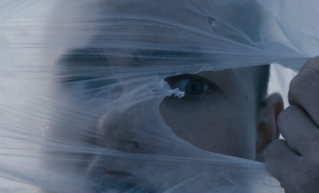
Social impact and campaign work leans on this constantly. A figure like 3.8 million, the reach of the Home Truths campaign for the Irish Wheelchair Association, means little as a spoken line buried inside an interview. Held on screen at the right size for the right length, it becomes the thing someone screenshots and shares.
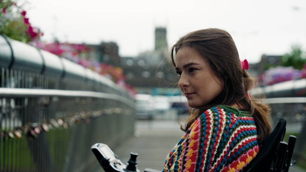
Naming someone on screen
A lower third doing its job identifies someone without stopping the film to do it: a name, a title, on and gone inside a couple of seconds, styled so it never competes with the face above it. The decision that takes longer than the design is usually who gets named at all and in what order, particularly on anything with more than two or three contributors, because the sequence itself reads as a hierarchy whether anyone intended it to or not.
Consistency matters more here than almost anywhere else in a project. The same name badge treatment, held for the same length of time, in the same position, across every interview in a film, is what lets an audience stop noticing the graphics layer and just absorb the information. The moment the style shifts partway through, the audience notices the shift instead of the content.
Working from brand guidelines, not around them
Most motion graphics work for us starts from a client's existing brand guidelines rather than a blank page: a type system, a colour palette, logo clear space and minimum sizes, sometimes a motion style already established on another channel. The job is less about inventing a new visual language for the film and more about translating a static brand system into something that moves convincingly, holds up at speed, and still reads as unmistakably that brand two seconds after the logo has left the frame.
Where there isn't an existing system, usually on a smaller social impact brief with no in-house design resource, we build a minimal one before touching the edit: two or three type sizes, a short colour list, a single entrance and exit style for text. It sounds like a small step, but it is what stops a film ending up with five different caption styles because five different edit sessions each made a fresh decision.
Turning a figure into something watchable
A bar chart built for a slide deck rarely survives being dropped straight into a film. Static infographics are designed to be read at a reader's own pace, with the eye free to jump around the page, and video offers no such luxury: the audience sees whatever is on screen for however long it's held there and then it's gone. Animating a chart so it builds in an order that matches the point being made, rather than appearing all at once, does more to make a statistic land than any amount of extra visual polish on the chart itself.
The harder discipline is usually restraint. A single animated number, held long enough to read twice, beats a cluttered dashboard of six moving figures competing for the same three seconds of attention. We'll often cut a client's own slide down to the one number that actually needs to survive the edit, which is not always a popular suggestion in the room when everyone has worked hard on the other five.
Matching the pace of the cut
Graphics built in isolation from the edit tend to feel bolted on, because their timing was decided against a stopwatch rather than against the rhythm of the film around them. We build most motion graphics inside the same edit session, cutting the animation itself to the beat of the surrounding footage, so a graphic in a fast-paced social cut moves differently from the same information delivered in a slower, longer-form documentary piece, even when the underlying design system is identical.
We build most graphics to survive without sound, on the assumption that a good share of any audience is watching on a phone with the volume off. A caption or a number that only makes sense alongside narration is a caption built for the wrong platform.
We also build most graphics inside the same software the edit lives in, rather than a separate pipeline, so a late change to the cut does not mean rebuilding a graphic from scratch somewhere else. That choice alone saves more revision rounds than any other single decision in the whole process, since the edit is almost never finished when the first graphics pass begins, and a rebuild in a separate tool has a way of quietly becoming the thing that blows a delivery deadline.
Good motion graphics gets out of the way of the footage it sits on. A graphic busy enough to compete with the film for attention is a mistake we catch in review, not a style choice.