
Video colour grading
Colour grading is the process of adjusting a film's colour and contrast after the edit is locked: warming or cooling it, lifting or crushing the shadows, matching shots taken in different light so they read as one continuous world. It decides what a film feels like as much as what it looks like, and those choices are rarely subtle once you know to look for them.
Grading happens after picture lock, once the cut cannot change again, because every adjustment is made relative to the shots around it. Grade a scene in isolation and it can look perfect on its own and wrong the moment it sits next to the scene before it. The whole film gets graded as one continuous read, not shot by shot.

How a grade actually gets built
A grade is built in two passes. The first is correction: levelling out exposure and white balance between shots so a cutaway filmed at midday matches the close-up filmed twenty minutes later once the light had shifted. None of that is creative yet. It's housekeeping, and skipping it shows up immediately as a flicker in skin tone or sky colour every time the cut changes shot.
The second pass is the actual grade: pushing a look onto footage that is already even. That happens through nodes rather than one global filter, so a shadow adjustment doesn't drag the highlights with it by accident. A colourist might isolate just the sky in one shot, just a jacket in another, nudging individual elements rather than tinting the whole frame and hoping it reads right everywhere at once. Waveform and vectorscope monitors sit alongside the footage through all of this, because the eye adapts to a colour cast within seconds and starts lying to you about whether a shot is actually balanced.

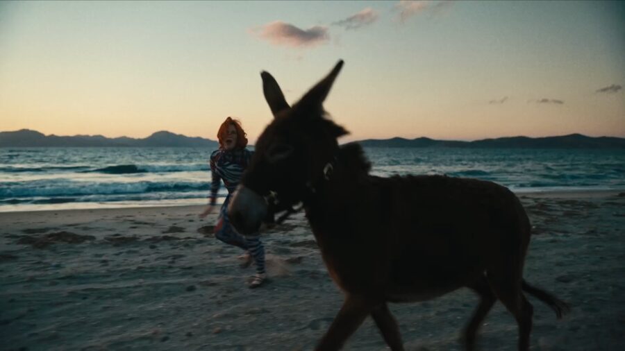
On CMAT's 'Whatever's Inconvenient', a dusk beach walk graded warm reads as memory rather than document, part of the lonesome, time-slipped feeling the whole video is built around. The same shot graded cold would read as documentary distance instead. We choose the grade to match what the story is actually doing, not to make everything look expensive by default, which is the trap a lot of commercial grading falls into.
Contrast does most of the emotional work
Colour gets talked about more, but contrast is usually what the audience feels first. Lifting the blacks so shadows never go fully dark gives a scene a hazy, nostalgic softness. Crushing them instead, so detail disappears into solid black early, reads as harder and more modern. Both are valid choices and neither is correct in the abstract: the question is always what the scene in front of the audience is trying to do to them.
Skin tone is the one element that gets protected above everything else, because an audience has spent a lifetime learning what a face is supposed to look like and will clock a wrong one even without knowing why. Every other adjustment in a shot gets checked against whether it has dragged a face too far from believable before it goes further.
Multi-camera shoots bring their own version of this problem. A live performance or an event with three cameras running at once rarely has them matched to each other exactly, even when they're the same model, because lenses and sensors drift slightly and the light hitting each one changes as a performer moves across a stage. Part of the grade is making sure a cut between camera one and camera three doesn't announce itself as a cut between two different cameras, which is a separate, quieter job from building the look of the film as a whole.

A look is a decision, not a filter
Teal shadows against orange skin has become such a default commercial look that it has started to read as the absence of a decision rather than the presence of one, the same way a default PowerPoint theme does. We'll use it when a brief genuinely calls for that high-contrast, big-budget feel, but we try to start from what the specific film needs rather than from what looks expensive by reflex. A quiet documentary about a community project does not need the same palette as a car advert, even though both are technically 'commercial work'.
We work from a reference, usually a handful of stills or a short reel, agreed with the client before the full grade starts. It saves a lot of second-guessing later: better to argue about a look for twenty minutes on a still frame than re-grade forty minutes of finished film because nobody said out loud what 'warmer' was supposed to mean. A shared reference makes that word mean the same thing to everyone in the room.
The same grade has to survive different screens
A broadcast delivery, a cinema DCP and a vertical social cut of the same film often need separate grading passes, not just a resize. Broadcast still largely sits inside the Rec.709 colour space, which clips highlights a lot sooner than an HDR deliverable can hold onto. A grade built to look rich on a calibrated reference monitor can look flat and grey on the phone screen most people will actually watch it on, so we check a grade against an ordinary phone and a cheap laptop panel as well as the suite's monitor, not instead of it.
Grading is the last creative decision made on a film, and it is also the easiest one to get wrong quietly, because a small shift in colour changes a mood before an audience consciously notices why.